Payment Experience
One of the most vital aspects of an e-commerce platform is the checkout experience. At Myntra, users spend an average of 3 minutes in the checkout process, which includes navigating through the cart, address, payment, and confirmation pages. Optimizing this experience is crucial for enhancing user satisfaction and boosting conversion rates, though it is also a delicate area to modify. From 2017 to 2019, I took ownership of the design for Myntra's checkout process, leading multiple projects that significantly impacted user experience and conversion rates.
Company
Myntra
Duration
2017-2019
My role
Senior Product Designer
About Myntra
Myntra is a premier fashion e-commerce platform in India, celebrated for its vast collection of clothing, footwear, and accessories from top brands. It provides a personalized and seamless shopping experience, featuring exclusive deals and convenient return policies.
#1
Credit wallet
In the winter of 2017, Myntra launched its own payment wallet, "Myntra Credit." This closed-loop wallet acts as a wrapper for gift cards, enabling instant checkout and faster refunds for customers, enhancing the overall shopping experience.
The Business Case
Myntra previously employed a Cashback system for return refunds and easy payments. Around 50% of cash-on-delivery users preferred receiving their refunds in Cashback due to its speed and simplicity, which required no additional verification. However, Myntra had to discontinue this system due to new payment regulations and rules. The alternative was for users to provide their bank details and receive refunds within 7-9 days, leading to a significant increase in customer escalations and calls. This highlighted the need for a more efficient and user-friendly refund mechanism.
The Problem
It is crucial to facilitate a faster checkout process once users decide to proceed with their shopping bag. We needed a mechanism that offered fewer failure rates and greater reliability to achieve this.
Investigation
During the initial stages of the project, I dedicated my time to understanding user behavior by collaborating closely with the user research team. We conducted multiple rounds of discussions and held stakeholder meetings to identify an optimal solution that would meet both user expectations and our business goals.
Key insights
Indian Online Shopping Trends in 2017
More than 40% of our total orders were Cash on Delivery. Many users preferred to pay upon receiving the product primarily due to a lack of trust and confidence in online purchases. They also expected a similar method for their refunds.
Longer Refund Processing Time
Receiving a refund via online bank transfer typically took 7-9 days. Users often contacted customer service to inquire about the status of their refund.
Increased Rejection/Return Rates for Cash on Delivery Orders
Historically, Cash on Delivery orders experienced higher return rates compared to orders paid for with online payment methods. This led to greater financial losses for our business on Cash on Delivery orders than on those using online payments.
Ideation
During the ideation phase, we recognized that transitioning Cash on Delivery users to online payment methods too swiftly could hinder our strategic objectives, particularly in expanding our reach into tier 2 and tier 3 cities across India. To address this, we decided to innovate by creating a closed-loop wallet within Myntra.
This solution would allow users to receive refunds effortlessly without needing to provide bank details, enabling instant access to funds as soon as returns were processed. The wallet funds could then be conveniently used for future purchases through a seamless, one-click checkout process.
We envisioned that this wallet system would not only enhance user convenience but also gradually build trust in online transactions. As users became more comfortable with the wallet, we anticipated a natural progression towards adopting full online payment methods, fostering greater confidence in the platform.
The identity
In developing the visual identity for our new payment mechanism, I was given the opportunity to lead the project, focusing on clearly communicating that "Myntra Credit" is a closed wallet exclusive to Myntra. After extensive collaboration with the team, I finalized the name "Myntra Credit" and spearheaded the logo design process. I produced multiple iterations, refining each based on feedback from the business team, until we arrived at a design that effectively represents our new payment solution.


Solution - Sneak peak
Based on the initial concept, I created paper wireframes to visualize the design. Later, I refined these wireframes, taking into account factors such as interaction, viewport size, hierarchy, content, usability, and promotions to ensure a user-friendly and effective design.


Why I chose this design?
Understanding the rationale behind my design choices is crucial for evaluation. Here are the key reasons I opted for this design:

Major screens

Top-up Mailers

Myntra Credit on Checkout
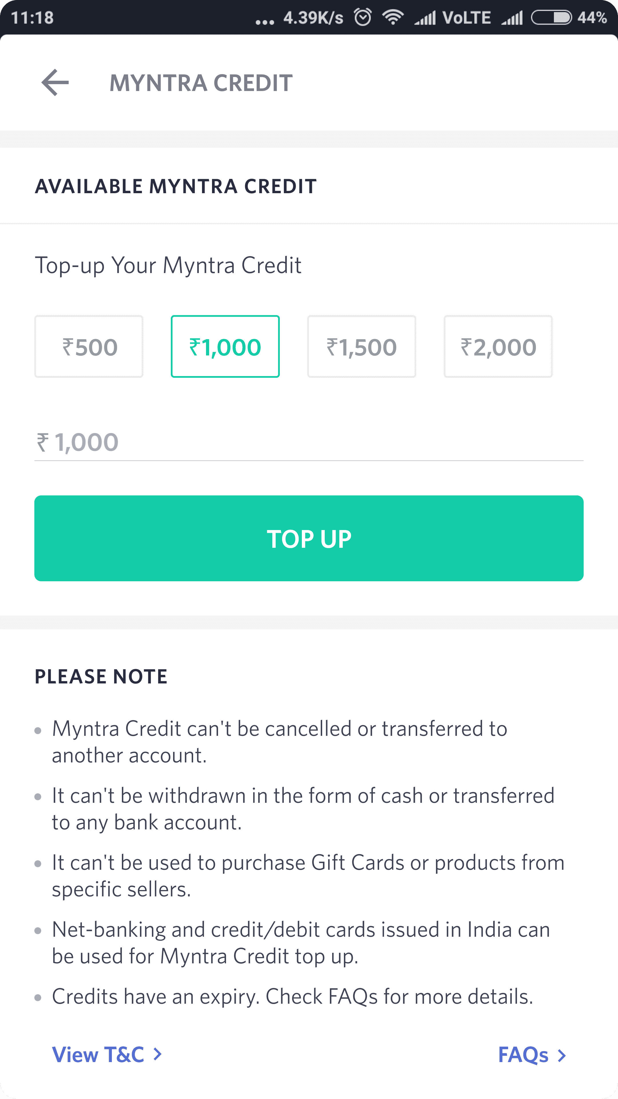
Top-up Credit

Credit Details

Access from Profile Section

Top-up Mailers

Expiry Mailers
Result & Impact
The adoption of Myntra Credit as a return refund mechanism has been very successful. On average, we have seen approximately 30% of Cash on Delivery refunds and about 10% of prepaid refunds being issued to Myntra Credit.
0%
CoD orders refund coming to Myntra Credit
0%
Prepaid orders refunds coming to Myntra Credit
Top-up per day
₹0Mn
Forward transaction per day
*All data based on Nov’18
#2
Checkout UI Cleanup
In the winter of 2017, Myntra launched its own payment wallet, "Myntra Credit." This closed-loop wallet acts as a wrapper for gift cards, enabling instant checkout and faster refunds for customers, enhancing the overall shopping experience.
Identified usability issues
UI and Visual enhancements
Unified checkout design
I streamlined the checkout design to match the app’s overall design language, providing a consistent and seamless user experience across all interfaces. I focused on reducing information clutter, enhancing clarity, and simplifying the checkout process.

Old cart page
New cart page
Enhanced notification display
Introduced a more effective display system for notifications such as new items in the cart, price changes, items out of stock, and cash on delivery restrictions integrating these seamlessly into the user interface to enhance user awareness without disruption.

Redesigned product cards
I reduced information overload on product cards by streamlining the content, focusing on essential details to facilitate quicker and clearer user decisions.

Old product card

New product card
Boosting engagement through motion design
I firmly believe in the impact of motion design on user emotions. During our redesign, we introduced motion support, incorporating vibrant animations and smooth transitions. For instance, take a look at how we’ve animated the 'Gift Wrapping' experience to capture the joy of gifting."
Assisting users in making informed decisions.
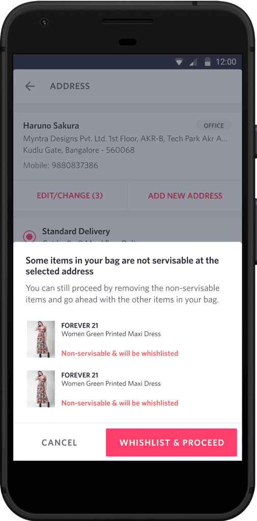
Informing users about critical details, like the unavailability of an item at a specific address, and guiding them towards the next steps enhances the user experience.
Streamlined payment page for quicker checkout
I optimized the payments page by displaying the most frequently used payment methods and available credit details prominently, helping users complete their checkout more quickly. Information is progressively revealed based on user intent, streamlining the process.
